
More Than a Name: The Heart Behind Judi Bontreger’s Brand
When Judi Bontreger came to us, she was looking for a brand that felt as grounded and authentic as the work she does. Through deep conversations, intentional design, and purposeful messaging, we built a brand that reflects Judi’s mission: to guide women back to clarity, peace, and purpose.
More Than a Name: The Heart Behind Judi Bontreger’s Brand
Something is captivating about a person who knows who they are and isn’t afraid to show up that way in every room.
That was Judi.
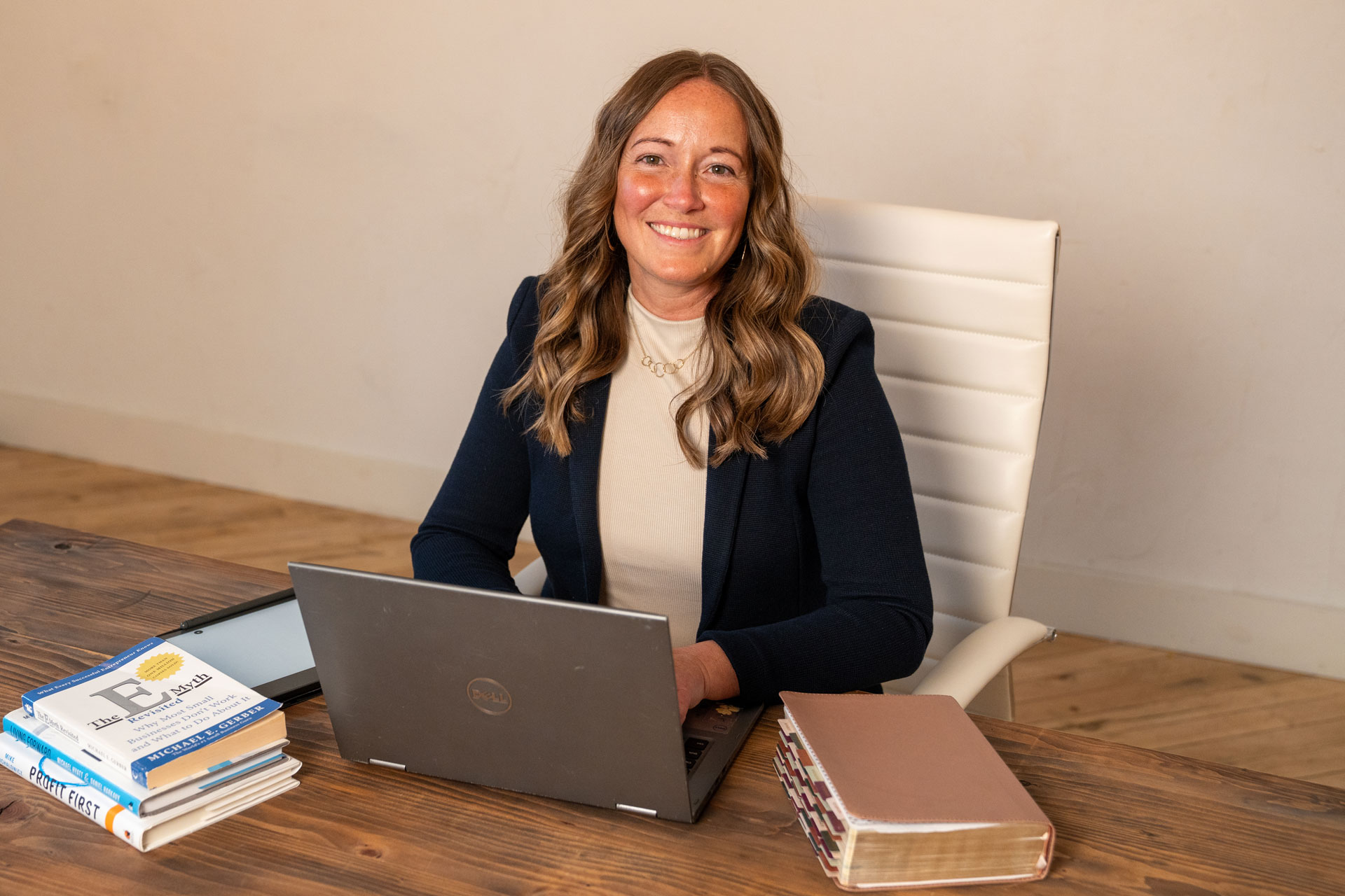
A certified life coach with decades of experience in ministry, mentoring, and leadership, Judi came to us not just with a vision but with a calling: to walk alongside women and help them rediscover their identity, find purpose, and establish peace in their lives. Her coaching practice wasn’t built on hype or hustle. It is rooted in truth, steadiness, and real transformation.
But the brand she had? It didn’t reflect that yet.
She needed a visual identity and tone of voice that was just as grounded as she was. She needed a brand that could honor her wisdom, her warmth, and the kind of life change she was offering her clients.
So, she partnered with Jointly Studios.

Sitting Across the Table
Before we ever opened a color palette or typed a word, we spent time getting to know Judi. The person. Her heart. The “why” behind her work.
We asked questions that had nothing to do with business and everything to do with people:
What do your clients need when they come to you?
What do you hope they feel when they leave?
What do you believe is possible for them?
Again and again, her answers came back to restoration. Healing. Clarity. Joy. Not the fleeting kind, but the kind that comes when you finally remember who you are and start living from that place and can create a life that is sustainable for you.
Those conversations shaped everything that followed.

Building from the Inside Out
It would have been easy to default to something soft and trendy, something like muted pastels, handwritten scripts, the usual wellness brand tropes.
But Judi’s story and the stories of the women she serves called for more than that.
We developed a brand built on the concept of elegance: a balance of strength and stillness. We paired earthy tones with structured typography. Clean lines with meaningful symbols. Words that whispered instead of shouted.
The result? A brand that felt like an invitation to exhale.

The Details That Matter
Judi’s logo, a custom monogram, is intentionally minimalist but not forgettable. It mirrors the kind of internal clarity she helps her clients uncover. We complemented the mark with a visual system that works just as well on her website as it does in a workbook, a social post, or a stage backdrop.
The messaging followed suit.
Every word was written with intention. Judi’s voice is not performative. It’s deeply personal. So the brand tone is calm, direct, and sincere. It doesn’t try to sell. It simply speaks.
We created a brand statement that Judi could confidently stand behind, one that captured her mission without over-explaining it. We wrote taglines, crafted bios, and established a narrative that Judi could carry with her, whether she was coaching one-on-one or speaking to a room of hundreds.

A Brand That Mirrors the Work
We didn’t create Judi’s message. We just helped reveal it.
The brand wasn’t about putting her into a box. It was about building a foundation she could grow from, something steady and true that would support her vision as it expands.
Now, when people meet Judi, they see the same thing: authenticity, clarity, and purpose. And that consistency is exactly what builds trust.

Final Thoughts
Branding is never just about how something looks. It’s about how something feels. For Judi, it needed to feel like truth. Like peace. Like home.
Helping her bring that to life was an honor.
And if you ask us, the world could use more brands like hers.
